Branding for Stock Café App
Alive stock cafe with basic form

Overview
Stock Café is a stock information app focused on U.S. stock market insights and discussions.
In this project, I developed three distinct main visual directions to explore different brand tones and visual identities. These proposals were presented to internal teams and key opinion leaders (KOLs) for review and selection.
Based on qualitative feedback and alignment discussions, I iterated on the selected direction to refine visual elements, improve clarity, and better match the community’s positioning.
This process emphasized collaborative decision-making, rapid iteration, and translating abstract brand values into scalable visual systems.
Time
2025/02
Role
UI / Branding Designer
・
Provided 3 proposals for teams
・
App store screenshots
・
Visual details on UI
Team
・
1 Designer (myself)
・
1 PM
・
KOL business teams
Company
CMoney, KOL business unit
Branding for Stock Café App
Alive stock cafe with basic form
Overview
Stock Café is a stock information app focused on U.S. stock market insights and discussions.
In this project, I developed three distinct main visual directions to explore different brand tones and visual identities. These proposals were presented to internal teams and key opinion leaders (KOLs) for review and selection.
Based on qualitative feedback and alignment discussions, I iterated on the selected direction to refine visual elements, improve clarity, and better match the community’s positioning.
This process emphasized collaborative decision-making, rapid iteration, and translating abstract brand values into scalable visual systems.
Time
2025/02
Role
UI / Branding Designer
・
Provided 3 proposals for teams
・
App store screenshots
・
Visual details on UI
Team
・
1 Designer (myself)
・
1 PM
・
KOL business teams
Company
CMoney, KOL business unit
Concept Exploration
I created three visual directions, each representing a different interpretation of the brand’s tone and audience positioning.
These design proposals were presented to internal teams and KOL partners for feedback and selection.
Concept A

Concept B

Concept C

Design Proposals
Proposal A

Proposal B

Iteration and Final Design
After reviewing feedback, Proposals 1 and 3 were combined and refined to create the final design.
Synthesize
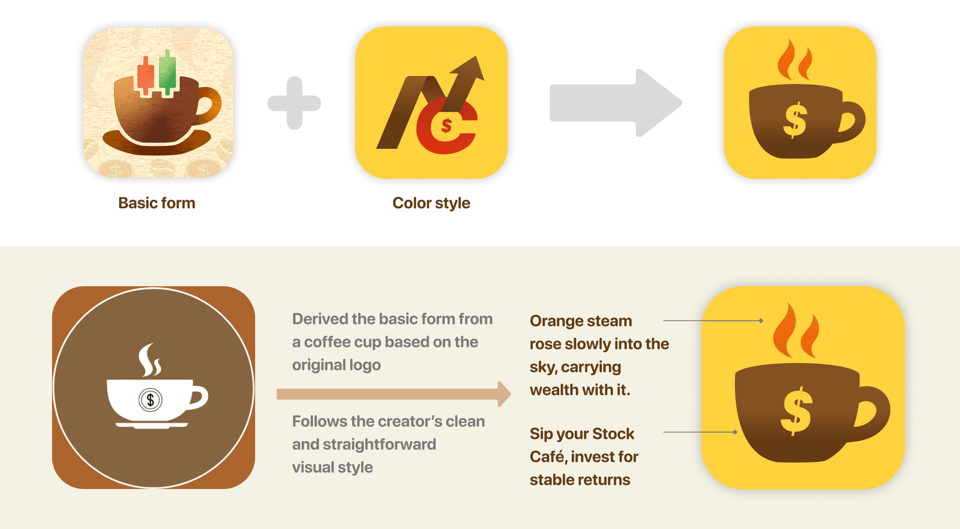
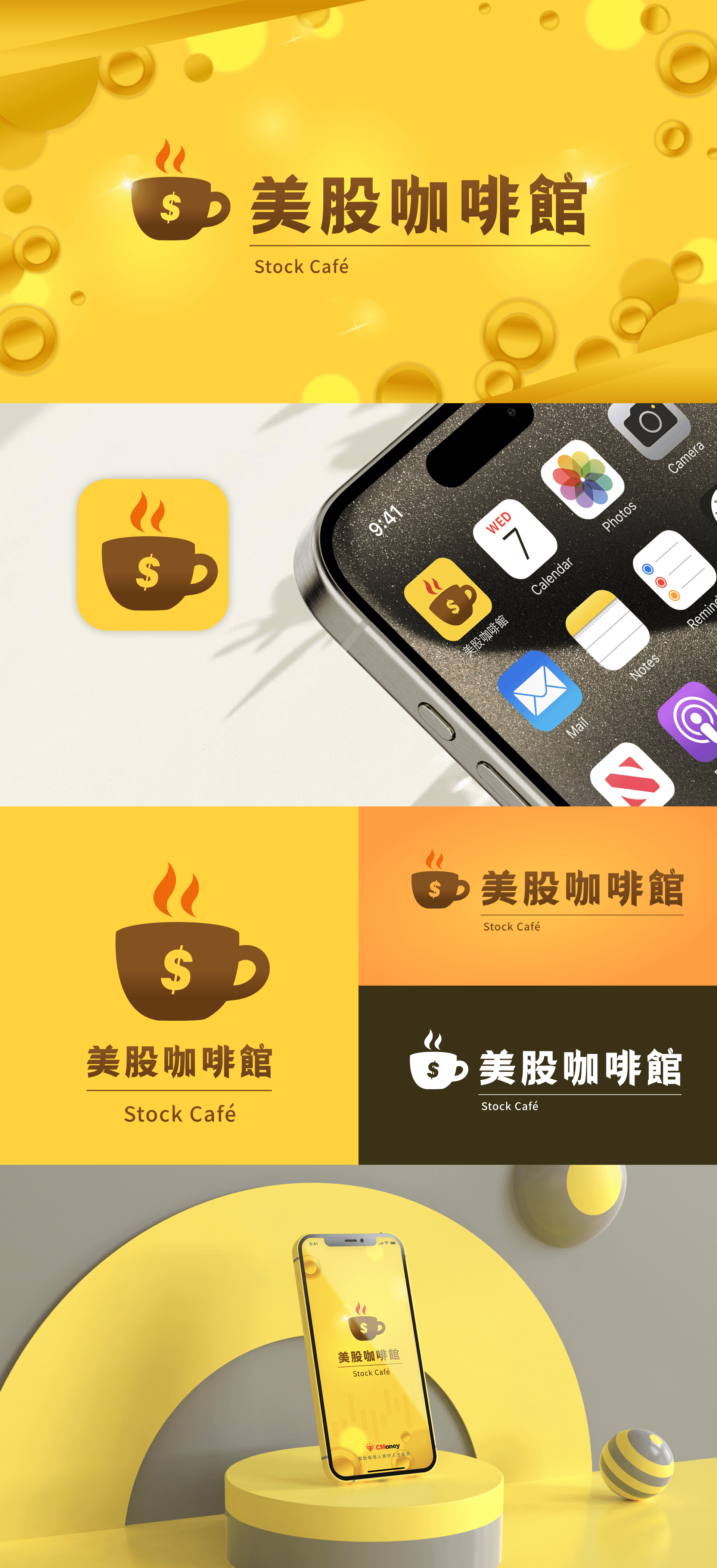
Final Design

Thanks for stopping by — you can reach me here
Copyright © Chinyi Abbie Lai 2026 ❤︎
Thanks for stopping by — you can reach me here
Copyright © Chinyi Abbie Lai 2026 ❤︎
Thanks for stopping by — you can reach me here
Copyright © Chinyi Abbie Lai 2026 ❤︎